Images are frequently the reason for the biggest byte-size downloads on a webpage. This is why it’s crucial to use images that are sized appropriately for your blog posts. If you upload large images to blog posts, it will make your pages take a long time to load and take up a lot of space on your server. If you’re having trouble to resize images for your blog, don’t worry because you’re not alone. It’s a common problem, especially with featured images. Let’s take a look at an example:
As you can see, because of the limited viewing height, you don’t see the rest of the image. The mistake here is trying to use a portrait image as the featured image. That’s because the featured image container allows for a landscape image – where the width of the image is longer than the height. In this article, we’ll go over easy ways to resize images and optimize images so your blog will run smoothly.
What size should the blog images be?
It all comes down to the design of your blog posts and how many images you want to include and which image resizer tool is best to use for resize photos. All of your images will be placed inside the content column, which is typically 800 pixels wide. So, if you want to cover the available space sufficiently, use an image that’s also 800 pixels wide. Not sure what the width of your content column is? No problem, it’s easy to figure out.
If you want to use developer tools, first open up any blog post you have published. If your blog is new, a sample post will work just fine. Once you have the post open, maximize the browser window and right-click anywhere on the page. From the right-click menu, choose “inspect.” Once you’re in the inspection window, look for the box with an arrow symbol in the top left corner of the screen and click it to turn on the “inspect element” function.
To check the dimensions of various elements on a page, just hover your mouse over them. For in-post images, find out the width of the paragraphs they are in. Note that paragraphs and image containers may have different dimensions for some themes. Images you upload for your blog shouldn’t be too small, but as long as they’re within 80-100% of the available content column width, you’ll be fine. This is because most blogs have automatic scaling. But they don’t have then you need an image resizer tool to resize images
How to Resize Images without losing quality?
Here are some Steps to Resize images From our Online Image resizer tool.
- Open image-resizer.org
Open google chrome then search https://image-resizer.org/ and open Website
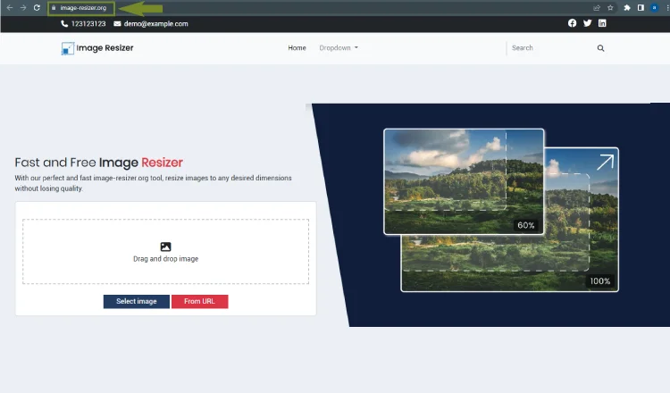
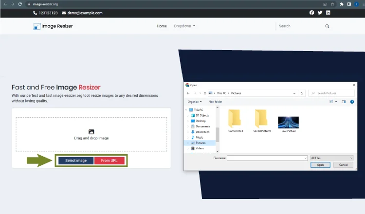
- Select Picture
Select the desired image that you want to Resize for your blog
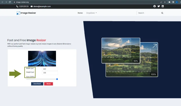
- Select Formate Ratio
Select the desired Ratio for your Picture
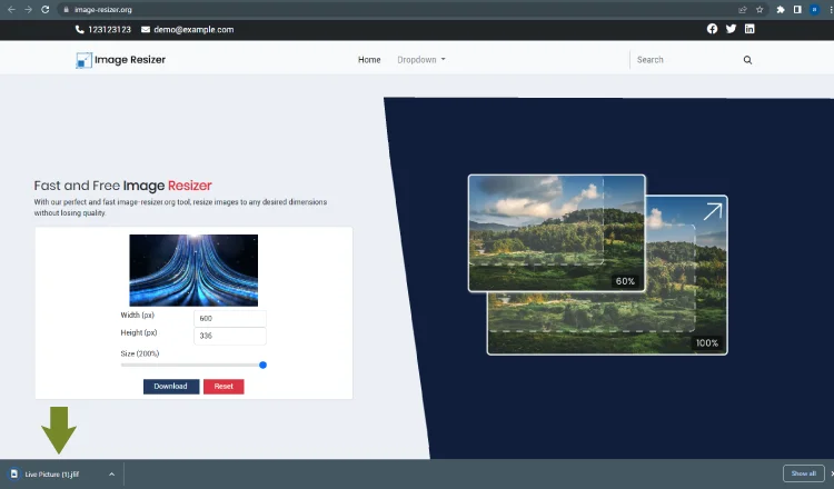
- Download your image
Click on the download button to download your resized image.
What are the standard image sizes?
The great thing about blog images is that there are no set standard sizes! This really allows you to be creative and work with a variety of dimensions, all based on the design of your blog. Of course, there are some dimensions that are more commonly used than others. Here are a few examples:
| Type | Width | Height | Comments |
| Featured Images | 1200 | 628 | Will work with most WordPress themes |
| Author image | 500 | 500 | Face at the center |
| Facebook Preview image | 1200 | 628 | – |
| Twitter post preview | 1024 | 512 | – |
| In-post images | 600-800 | varies | – |
| Thumbnail | 150 | 150 px | – |
| Screenshots | 600-1280 | varies | Try to match the available content width |
| Ful-width images | Up to 2560 px | varies | To cater to wide screens |
| Infographics | 600-1100 | Up to 2000 |
What’s more important: image size or aspect ratio?
There are a lot of factors that affect the consistency of your photographs, but one that is often overlooked is the aspect ratio. The aspect ratio is the relationship between the height and width of the image. Some famous aspect ratios contain
- 4:5 – An ideal choice for portrait photos.
- 1:1 – Prominently used on Instagram for main feed photos.
- 4:3 – Utilized for monitors, TV screens, smartphone cameras, and online photos.
- 16:9 – Ideal choice for landscapes.
- 3:2 – Widely used for print and professional photography with DSLRs and film cameras.
Our image resizer(image-resizer.org) deals with all the ratios. This is one of the best image resizer tool to resize images without losing quality.
Steps to optimize images for your website
Below are the 3 steps to optimize images for your website.
Choosing the appropriate format
When it comes to images, there are multiple formats to choose from, each of which will result in different file sizes and quality. Some formats, like JPEG, PNG, and WEBP, are best suited for the web. The first step in image optimization, then, is understanding which format is best for the image you’re working with.
Saving for the web use
If you are familiar with Gimp or Adobe Photoshop, you may have noticed that Photoshop includes the option to save images for the web instead of just saving them to your computer. If you’re not a fan of Photoshop, you can try using our photo resizer tool for Optimizing images for the web will save bandwidth and disk space on the server.
Lossless Compression
Resizing images is a pretty fundamental skill for anyone working in web design. Whether you’re trying to make an image fit a particular spot on your page or scaling an image up or down, it’s important to be mindful of how you’re resizing it so that you don’t end up with a grainy, low-quality image. You can easily resize your image either scaling down or scaling up without losing quality.